2012
2013
2014
2015
2016
2017
2018
2019
2020
2021
2022
2023
2024
2025
S
N
A
Q
E
A HAPPY NEW YEAR
A HAPPY NEW YEAR
A HAPPY NEW YEAR

<!DOCTYPE html> <html lang="en"> <head> <meta charset="UTF-8"> <title>Document</title> </head> <body> <main class="container"> <section class="fetures"> <div class="feature-item"> <img src="#" width="300" height="146" alt="Laptop"> <h2 class="feature-name">Web sites</h2> <p>Lorem ipsum dolor sit amet, consectetur adipiscing elit. In facilis amet.</p> </div> <div class="feature-item"> <img src="#" width="300" height="146" alt="Phone"> <span class="feature-name">Apps</span> <p>Lorem ipsum dolor sit amet, consectetur adipiscing elit.</p> </div> <div class="feature-item"> <img src="#" width="300" height="146" alt="Presentation"> <main class="container"> <span class="feature-name">Presentations</span> <section class="features"> <p>Lorem ipsum dolor sit amet, consectetur adipiscing elit. Doloremque <div class="feature-item"> </main> beatae vellure quae.</p> <main class="container"><div class="feature-item"> </div> <section class="features"> </section> <div class="feature-item"> </main> <div class= </body> <img src= </html> <b class= </div> <p>Lorem </section> </div> </div> </main> <div class= </body> </main> <img src= </html> <div class= <b class= <div class= "feature-item"> </section> "feature-item"> <title>Document</title> <div class= <img src="#" <main class="container"> "feature-item"> width="300" </section> <div class= <img src="#" height="146" <div class= "feature-item"> width="300" alt="Phone"> "feature-item" <div class= height="146" </div></div> <img src="#" "feature-item"> alt="Phone"> </section> width="300" <img src="#" </div></div> </main> height="145" width="300" </section> </body> alt="Phone" height="146" </main></div> </html> </div></div> alt="Phone"></body></div> <div class= </section></div> <div class="feature" "feature-item"> </main></main> </section></main> <main class="container"></body> </body></html> <section class="features"> <div class="feature" </section>

<!DOCTYPE html> <html lang="en"> <head> <meta charset="UTF-8"> <title>Document</title> </head> <body> <main class="container"> <section class="fetures"> <div class="feature-item"> <img src="#" width="300" height="146" alt="Laptop"> <h2 class="feature-name">Web sites</h2> <p>Lorem ipsum dolor sit amet, consectetur adipiscing elit. In facilis amet.</p> </div> <div class="feature-item"> <img src="#" width="300" height="146" alt="Phone"> <span class="feature-name">Apps</span> <p>Lorem ipsum dolor sit amet, consectetur adipiscing elit.</p> </div> <div class="feature-item"> <img src="#" width="300" height="146" alt="Presentation"> <main class="container"> <span class="feature-name">Presentations</span> <section class="features"> <p>Lorem ipsum dolor sit amet, consectetur adipiscing elit. Doloremque <div class="feature-item"> beatae vellure quae.</p> <main class="container">width="300" </div> <section class="features"> </section> </section> <div class="feature-item"> </main> </main> <div class= </body> <img src= </html> <b class= </div> <p>Lorem </section> </div> </div> </main> <div class= </body> </main> <img src= </html> <div class= <b class= <div class= "feature-item"> </section> "feature-item"> <title>Document</title> <div class= <img src="#" <main class="container"> "feature-item"> width="300" </section> <div class= <img src="#" height="146" <div class= "feature-item"> width="300" alt="Phone"> "feature-item" <div class= height="146" </div></div> <img src="#" "feature-item"> alt="Phone"> </section> width="300" <img src="#" </div></div> </main> height="145" width="300" </section> </body> alt="Phone" height="146" </main></div> </html> </div></div> alt="Phone"></body></div> <div class= </section></div> <div class="feature" "feature-item"> </main></main> </section></main> <main class="container"></body> </body></html> <section class="features"> <div class="feature" </section>

TOP BLOG DESIGN RECIPE vol.4 : Web Assemblyを使って3Dで商品紹介
#DESIGN RECIPE#CREATIVE

DESIGN RECIPE vol.4 : Web Assemblyを使って3Dで商品紹介

2020.01.15 Shinichiro Watanabe

最近流行しつつあるWeb Assemly(wasm)を使うとWebでこんな商品紹介ができます。

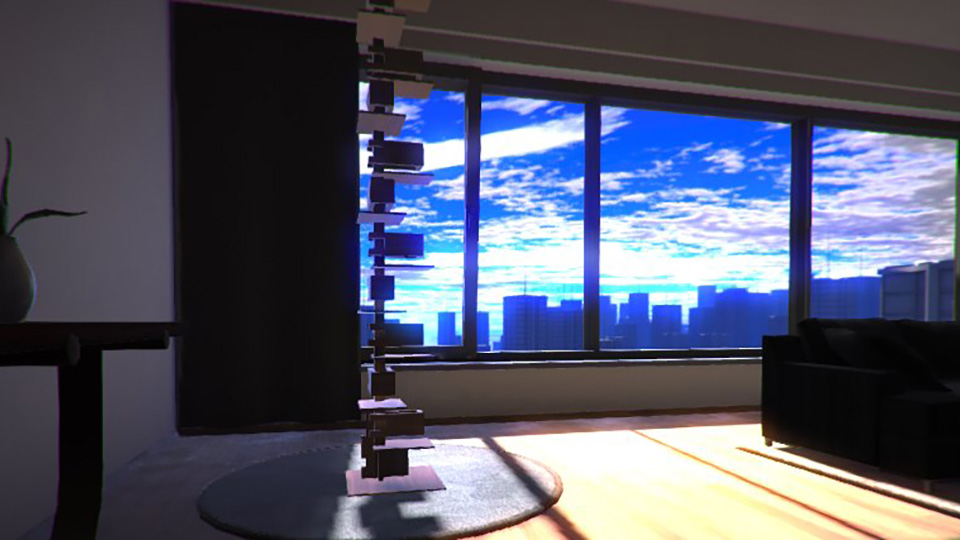
Web AssemblyによるTALIESIN 2 Viewer

wasmを商品紹介として利用した場合の一例

動作環境:Chrome, Firefox, Edge, Android(Chrome)およびiPhone(Safari) 各最新版
この動作デモはUnityを利用して作られています
※IE非対応

 
商品を3Dで回したい

情報量が多ければ多いほど、判断材料が増え、コンバージョンも増えるというのが、デジタルマーケティングでは定石です。(ex:ECサイトなら商品の写真はたくさんあったほうが売れる…等)
用途やシーンなど様々なバリエーションの写真を用意して、ユーザーが”その商品をつかった自分”を体験するための手助けをします。
しかしどれだけの写真をつかっても、その体験は実物に触れて確認できる実店舗に軍配があがります。

これまでも3Dでグルグル回せる表現はありましたが、素材の表現がイマイチで色の違いくらいしかわかりませんでした。
モノの素材を表現するには光と質感が必要不可欠です。しかし光や影、質感、映り込みなどリアルな処理するほどの性能がありませんでした。

昨年 ついに Web Assembly(以下、wasm)という技術が主要ブラウザに実装されました。wasm ではこれまでの技術に比べると高速な処理が可能です。
リアルな光の処理、質感の表現が飛躍的に向上しました。

Web Assembly

wasmは最近の技術です。
これまでのブラウザによる3D表現において最大の制約だったjavascriptへの依存を無くし、ブラウザが端末のパワーを限界近くまで使用できるようにするものです。
javascriptに依存していた頃と比較して10倍以上の処理を行うことができ、2Dや3D表現のほかにも機械学習などへの活用が期待されています。
3Dにおいては複雑な形状や材質表現、膨大な負荷のかかる光の計算(反射・屈折)もこなせるようになりました。

3D表現になぜそれほど処理能力が必要なのか。
人間が物体を視認する時は必ず光を介しています。物を見るということはその物体が反射した光、あるいはその物体が発した光を見ていることになります。
ブラックホールのように光を反射しない物体、光を発しない物体を見ることはできません。
物体の色や質感は網膜に映った光そのものです。
3Dにおいてもこれは同様で、光源に照らされていないポリゴンや、発光していないポリゴンは描写できません。つまり描写するためには、そのポリゴンと光源との関係性を計算によって明らかにする必要があるということになります。
当然光源が増えればそれだけ計算も増え、反射率をもつポリゴンであれば映り込みなどの計算も必要になり、透明度を持つポリゴンであればさらに屈折の概念が加わります。
こうして数多の計算を経た結果、網膜であるディスプレイに映った光が3Dの描写となります。

このような様々な計算をスマートフォンレベルでも可能にしたのがwasmです。
商品紹介以外にも色々な活用法があると思います。(アート作品の展示、建築物の外装・内装の表示、産業用ロボットの動作シミュレーション、機械学習を利用したコンテンツ etc)
ウチでもやってみたい!という際にはぜひお電話やメールフォームからご相談ください。

CATEGORY
TAG
ARCHIVE